
How marketing teams design email in 2026: what the data says
Emails get built faster, but review, generic AI drafts, dark mode and accessibility still slow teams down. The data, what we learned, and what to change.

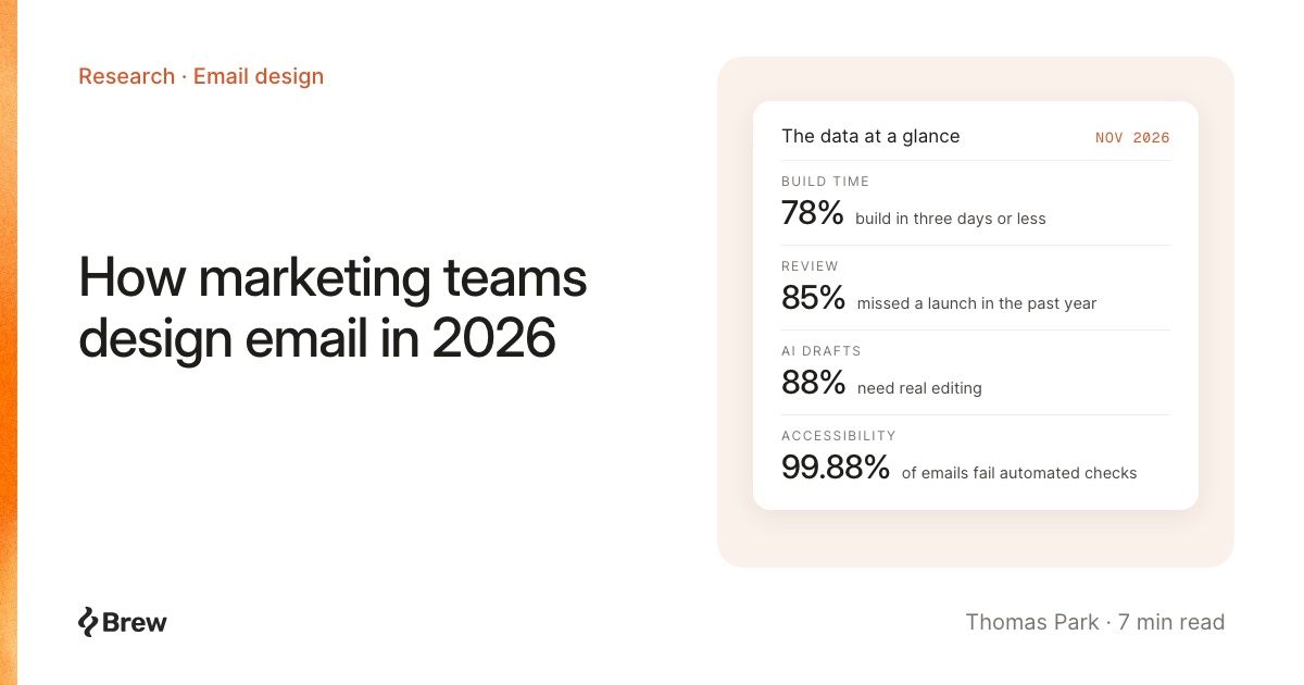
Ask an email designer what changed in the last two years and you'll hear two things. Building an email got much faster. Getting it approved, keeping it on brand and making it look right in every inbox did not.
We read through the recent research on how teams design email, and compared it with what we've learned building and testing Brew. Here's where things stand. Every number links to its source, and since most email research comes from companies that sell email tools, including us, we say whose data it is.
Building got faster. Approval didn't.
In 2024, 62% of teams said producing one email took two weeks or more. In Litmus's State of Email 2026, 78% say they now take three days or less (500 marketers, vendor survey; the answer options changed between years, so treat the trend as directional).
Not everyone feels that speed. Really Good Emails' survey of 1,677 email professionals put the average at 8.21 business days per email, and rated satisfaction with email tools at 6 out of 10.
The difference is review. Knak's 2026 survey of 333 enterprise marketing leaders (vendor) found:
- 69% go through two or three rounds of revisions before approval
- 60% involve four or more people in a single email
- 47% name approvals as the top obstacle to launching on time
- 85% missed at least one launch date in the past year
The build is no longer the slow part. Getting a draft close enough to on-brand that reviewers sign off quickly is.
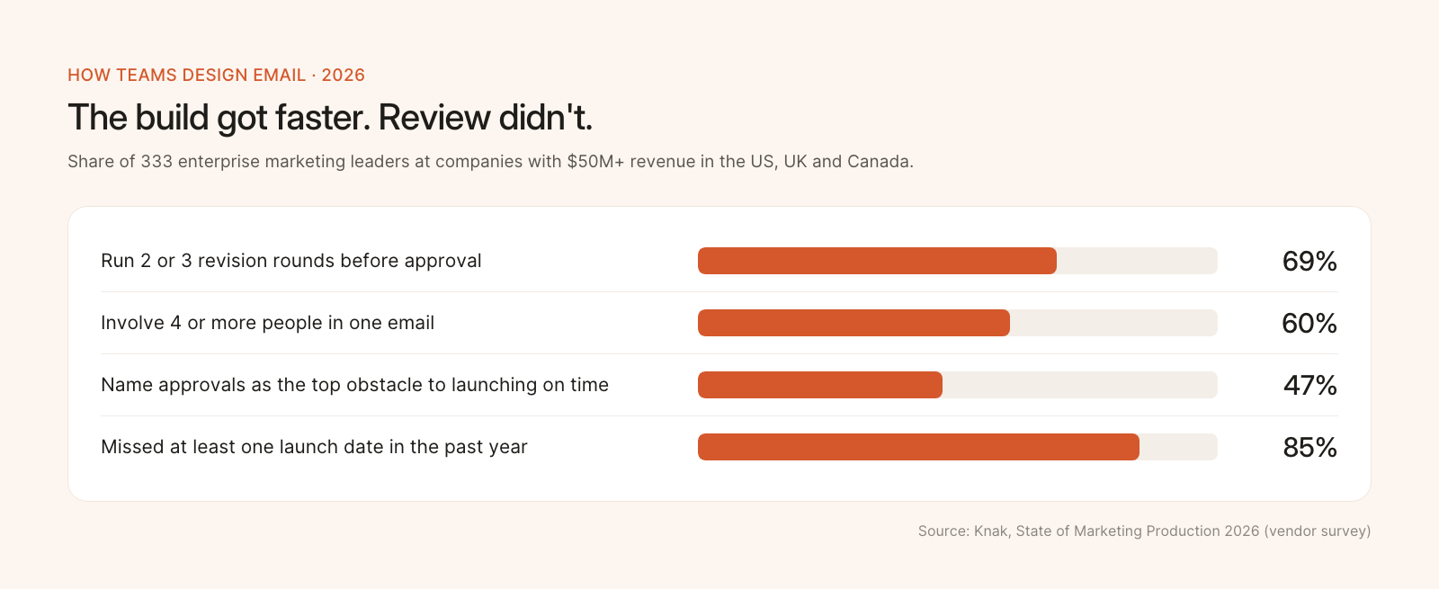
Where the time goes now. Knak vendor survey, 2026.
AI writes the first draft. People rewrite it.
AI is now normal in email production. In the same Knak survey, 64% use it for first-draft copy and 56% for images. But 88% say the output needs moderate or substantial editing, and only 11% get by with light edits.
Readers notice the unedited version. Adobe surveyed 1,007 US consumers (Adobe Express, vendor):
- 72% suspect they've received an AI-written brand email
- 18% have unsubscribed because of it
- 37% name "generic" among the traits they like least
HubSpot's State of Marketing found 62.7% of marketers say they need more distinctive, human content to stand out from AI content.
The problem isn't AI. It's AI that doesn't know the brand, so every email comes out in the same safe shape and someone has to redesign it by hand.
What we learned
We saw the same thing in our own product. When we reviewed a sample of emails Brew's agent had written, more than half reused a layout shape another email from the same brand had already used. On brand, but samey.
So we changed the approach. Brew writes a design guide for each brand, email-design.md, and the agent reads it before every email and picks a layout for that specific email. On ten brands we'd never used before, the share of emails with real design beyond text and a logo went from 12% to 82% (the full story). And because people edit more than they create, about four edits to every new email over the last 30 days, we made sure each edit reports exactly what changed.
Design for two inboxes first
Apple Mail and Gmail account for about 93% of the opens Litmus tracks: 76.6% Apple and 16.1% Gmail in September 2026. Apple's share is inflated by Mail Privacy Protection, which opens email automatically, so read it as "the inboxes that matter most," not "three in four people use Apple Mail."
Those two inboxes treat dark mode very differently.
- About a third of tracked opens happen in dark mode, based on 2022 data in Litmus's dark mode guide.
- Apple Mail and Gmail on desktop leave your colors alone. The Gmail iOS app has historically fully inverted them, and Gmail on Android partly does.
- Dyspatch reported in October that the Gmail apps now respect a light-only
color-schemesetting in real sends, even where preview tools still show inversion. It's one vendor's finding, so test it on your own phone.
The classic dark mode casualty is white text on a photo. The app darkens the text but not the image, and the copy nearly disappears. One of our customers shared the technique they used to prevent it, and Brew now applies it to every email it sends. Our other rule: check the real inbox, not just a preview. Brew's inbox previews render your email in actual clients for that reason.
Accessibility is mostly a defaults problem
The Email Markup Consortium's 2026 accessibility report ran automated checks on 376,348 emails. 99.88% had serious or critical issues, and only 8 passed. The most common failures are boilerplate:
| Issue | Share of emails |
|---|---|
| No text direction set | 97.4% |
| No language set | 95.7% |
| Layout tables not marked as presentation | 83.8% |
| Links with no readable text | 71.2% |
| Poor color contrast | 58.5% |
| Images with no alt text | 47.9% |
The report points the finger at platform defaults. Not one of the 10,566 emails it checked from Substack, Shopify and Beehiiv passed. Litmus found only 47% of companies apply even basic measures such as alt text.
That's good news, because defaults are fixable once, for everyone. Brew sets each email's language and text direction and marks layout tables as presentation on every email it renders, and before an email goes out it adjusts any text that's too low in contrast against the background it actually sits on. You shouldn't need to remember any of it.
Motion works best when it's yours
58% of teams use animated GIFs, according to Litmus's 2023 design report, and most who use them report somewhat better results. That's self-reported, and we'd rather show you measured lift, but we haven't found a good recent study.
What we can share is what we found building animation capture, which turns a brand's own website animations into email GIFs. Across 42 brand websites, 19 had self-playing media, such as product videos, Lottie or WebGL animations, that works as a GIF. The rest only moved through scroll effects, carousels and hover states, which come out cropped or meaningless in an inbox. If your site has a product video, that's often the best GIF your emails will ever have.
Teams want systems, not starting from scratch
Teams know what they want. In Litmus's 2023 design report, 55% used or planned to use a design system, and more wanted a component library than had one. Yet 42% still built new emails by reusing code from old ones.
The payoff of a system shows up most in automated email, which runs for months. Omnisend's 2026 ecommerce report found automations were 2% of sends but 30% of email revenue across 150,000 brands (vendor data). Those are the emails that most deserve a design that holds up, and the ones teams least want to rebuild by hand.
What we'd change in your process
- Make the first draft approvable. Put the effort into brand context, not prompt length. A draft that already looks like you cuts a revision round.
- Edit in small steps. Ask for one change at a time and check it. That's how most of our customers work, and it's faster than rewriting.
- Test dark mode in a real Gmail app. Especially any section with light text over an image.
- Fix accessibility at the template level. Language, direction, presentation roles, alt text and contrast, once, for every email.
- Use your own motion. A product video from your site beats stock animation.
- Spend design time on automations. They run longest and earn the most per send.
If you want to see what your brand looks like with this approach, add it to Brew and ask for your next email. The first draft takes about a minute. The edits are where it gets good.