How we taught Brew's email agent to design for your brand
Customers said their Brew emails were on brand but too alike. How we taught the email agent to make layout decisions, and how your brand guide steers them.

The feedback we kept hearing went something like this: the colors are right, the fonts are right, it sounds like us, but the launch email and the newsletter look like the same email.
That was fair, and it isn't only a Brew problem. Across the industry, AI writes most first drafts now, and most of those drafts need work. In Knak's 2026 survey of enterprise marketers, 88% said AI output needs moderate or substantial editing. Readers notice too: in an Adobe survey of 1,007 US consumers, 18% had unsubscribed from a brand over email they suspected was AI-written, and "generic" was one of the traits they disliked most. Both are vendor surveys, and they point the same way.
Brew's emails were on brand, and they were plain. A headline, a paragraph, a button. A good designer doesn't start every email from the same layout. They look at what the email is for and pick a shape for it: open on the product, put the offer on a band of the brand color, give the main button some weight.
We measured it, too. When we reviewed a sample of our agent's emails, more than half reused a layout shape another email from the same brand had already used.
So we set out to teach the email agent to make those calls.
Giving the agent a designer's choices
We gave the agent a set of moves it can make on any email:
- color bands from your palette
- backgrounds drawn from your brand's own materials and textures
- product cut-outs placed on your colors
- buttons with a little depth
- animations from your own website, captured as GIFs when you add your brand. Across 42 brand sites we tested, 19 had self-playing media that works this way, usually a product video
Then we asked it to decide, before writing a word, which of those this particular email needs. A product launch might open on the product with a color band behind it. A digest might stay on your plain page with clear section labels. A sale might put the offer on a drawn background.
Your brand guide has the final say
Early versions taught us something important. When the agent uses the same moves on every brand, a dark, illustration-heavy brand looks right and a cream, minimal brand looks like someone else's email.
So every move now checks your brand first. In Brew that means email-design.md, the design guide Brew writes about your brand when you add it.
- If your guide says your accent color is used sparingly, the agent won't build a whole section on it.
- Drawn backgrounds appear only when your brand has a material or texture worth drawing from.
- The closing section stays on your own colors unless your design calls for more.
- Buttons get a little depth by default, unless your guide or your brief says flat.
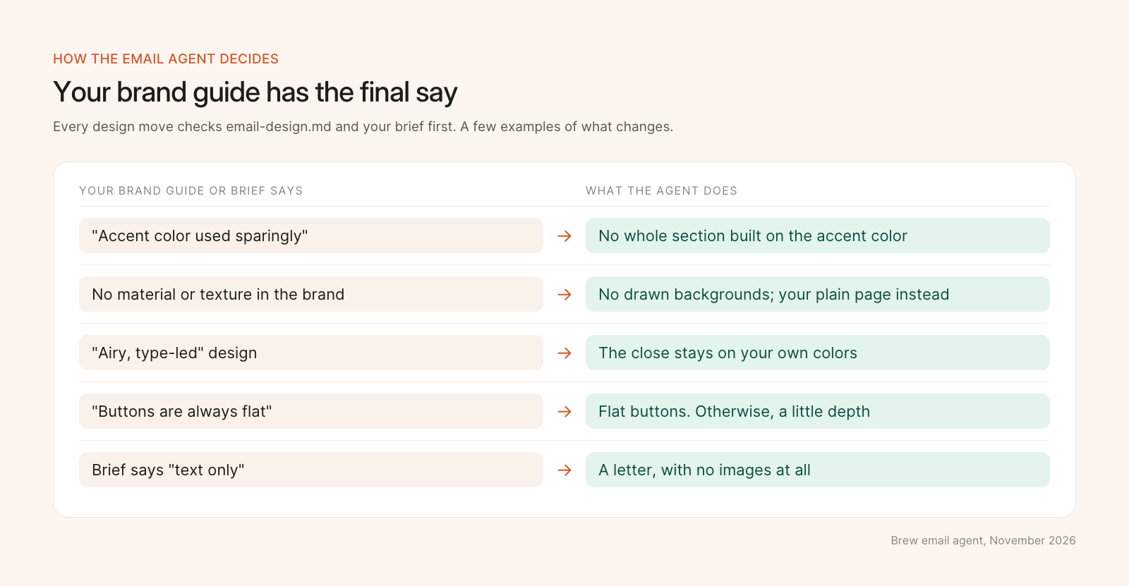
Every design move checks your brand guide and your brief first.
Tested on brands we'd never seen
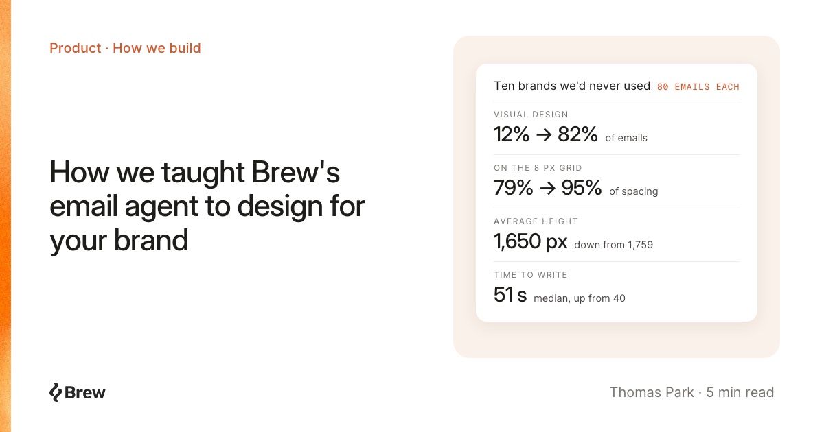
We didn't want to tune this on brands we already knew. So we picked ten well-known brands we had never used in any test, across retail, food and drink, software and media. We added each one fresh, wrote four briefs for each, and generated every email twice, on the old agent and the new one. That's 80 emails per version.
| Per email | Before | After |
|---|---|---|
| Emails with a visual element beyond text and logo | 12% | 82% |
| Average height | 1,759 px | 1,650 px |
| Spacing that sits on an 8 px grid | 79% | 95% |
| Median time to write | 40 s | 51 s |
The emails got more visual, a little shorter, and tidier. They also take about 11 seconds longer to write, which we think is worth it for an email that looks designed.
Getting the look you want
Most of your next emails from Brew will have something visual: a color band, a product shot on your color, an animation from your site, a button with some weight.
You stay in charge of how far it goes:
- Brief it like a designer. "Open on the new product, dark background, one strong button" works better than "make a launch email."
- Ask for plain when you want plain. "Flat buttons." "Text only." "Keep it like a letter." The brief wins over the agent's defaults.
- Tune your brand guide. Your
email-design.mdis what the agent reads before every email, and you can edit it. A line like "accent color used sparingly" or "buttons are always flat" shapes every email after it.
Thanks to everyone who sent us emails they wanted Brew to look more like. Keep them coming.
The changelog has the short version: More visual emails, including your site's own animations.